Coca-Cola European Partners

Develop a world-class corporate website that engages its diverse stakeholders

Overview

Coca-Cola European Partners, the largest bottler company in Europe, reached out to Conran Design Group to develop a new visual identity that would clearly differentiate them from their mother company (The Coca-Cola company).

But as their corporate website wasn’t reflecting their scale and quality standards, my team has been assigned to redesign and improve their online presence.

Agency:
Conran Design Group

ECD:
Juan Pedraza

Visual Identity:
Holly Dennis

UI Designer:
Natalia Gasto

Motion Designer:
Ronald Santiago

In order to improve their corporate website and make them stand out from their peers, I designed a flexible and scalable solution (CMS: silverstripes) that can be own and self-manage once launched.

I also recommended to drive the business towards a more story-telling approach to communication and to deliver a visually impressive and compelling reason for diverse audience groups to engage with the company.

And finally, I worked with the brand team to launch a brand refresh through the .com, that reaches AA accessibility standard.

My role

I was the lead UX and UI designer on this project, I started with conducting a UX audit of the existing website to identify pain points and potential opportunities.
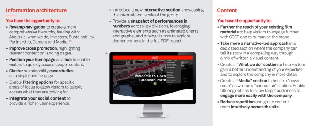
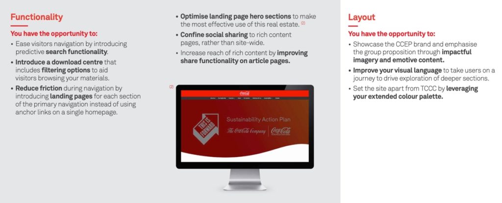
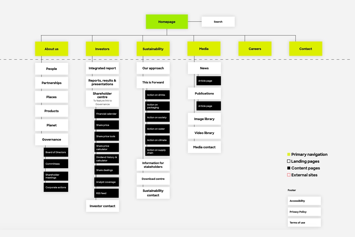
Then, I simplified the information architecture to make each user’s journey more valuable, to reduce duplication of content, and to ensure content was easily accessible.
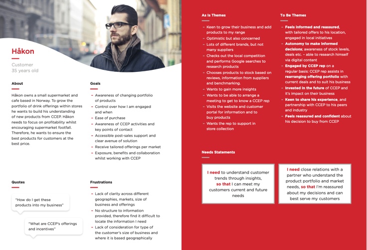
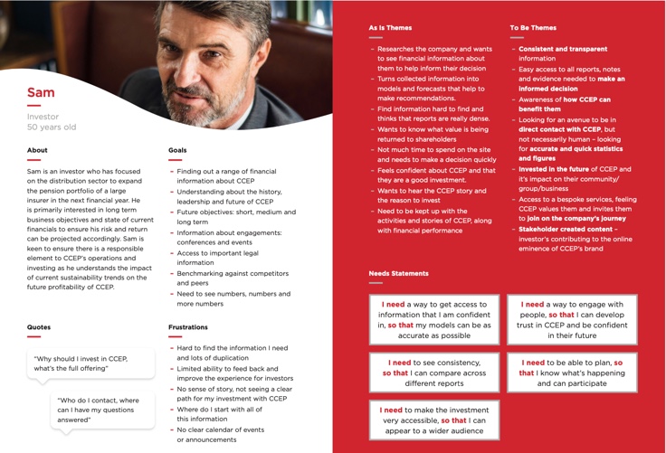
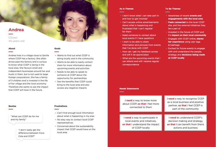
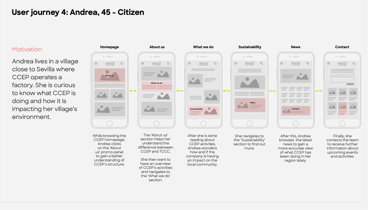
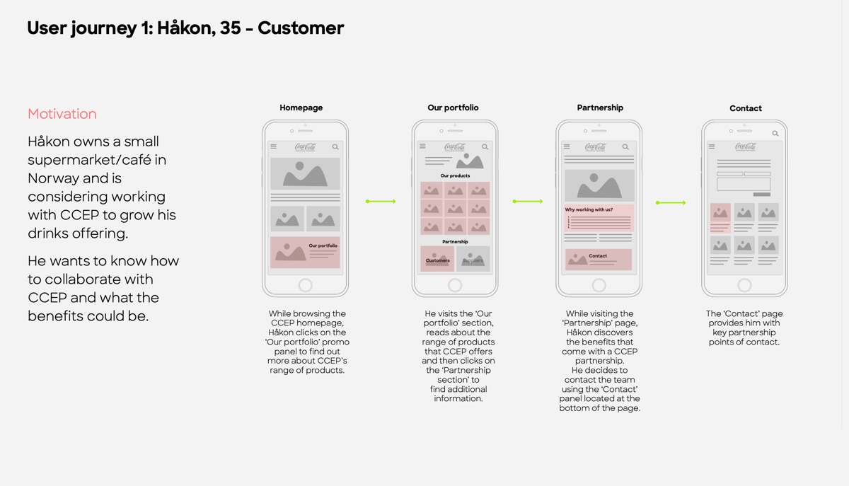
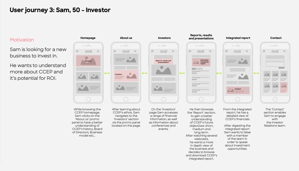
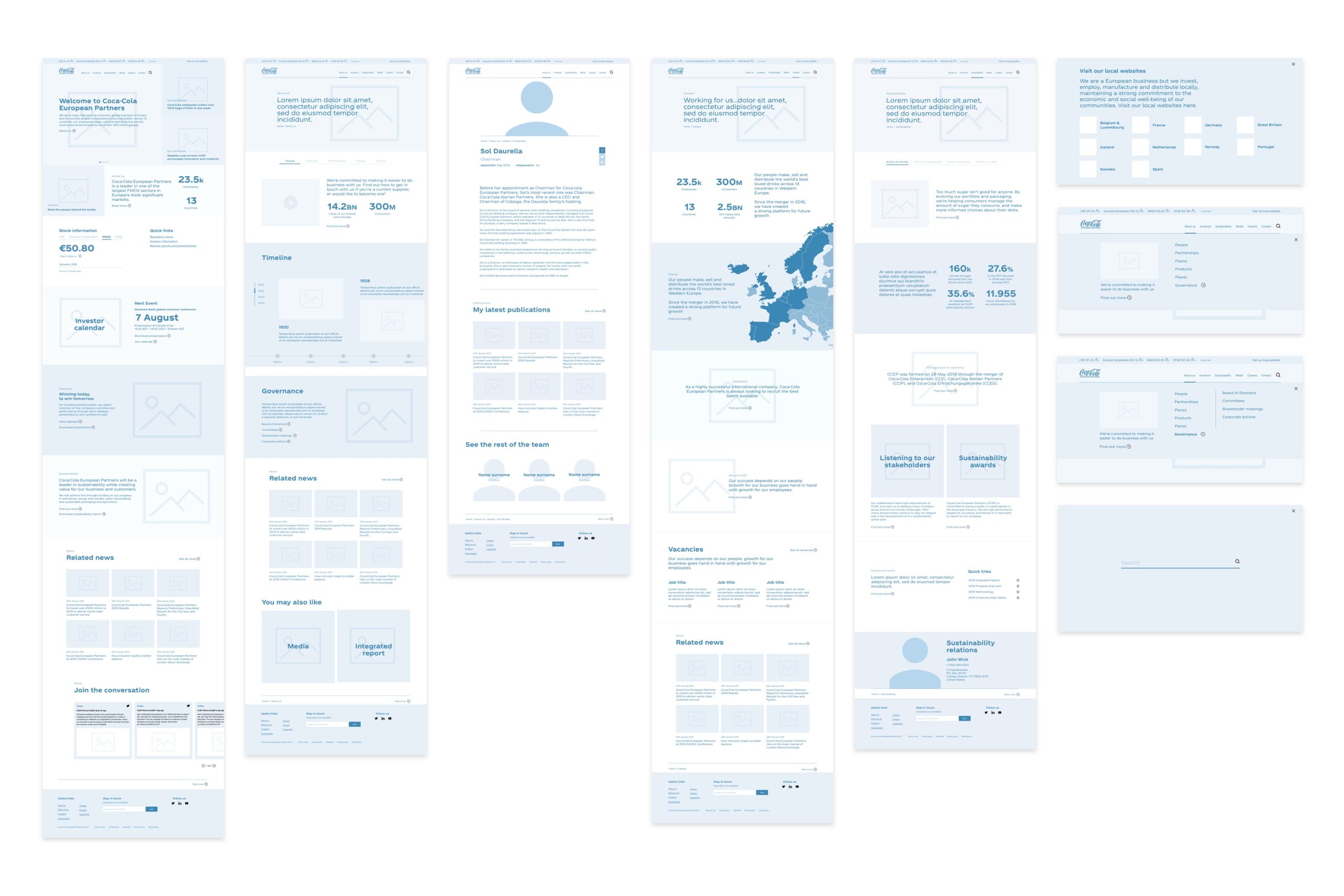
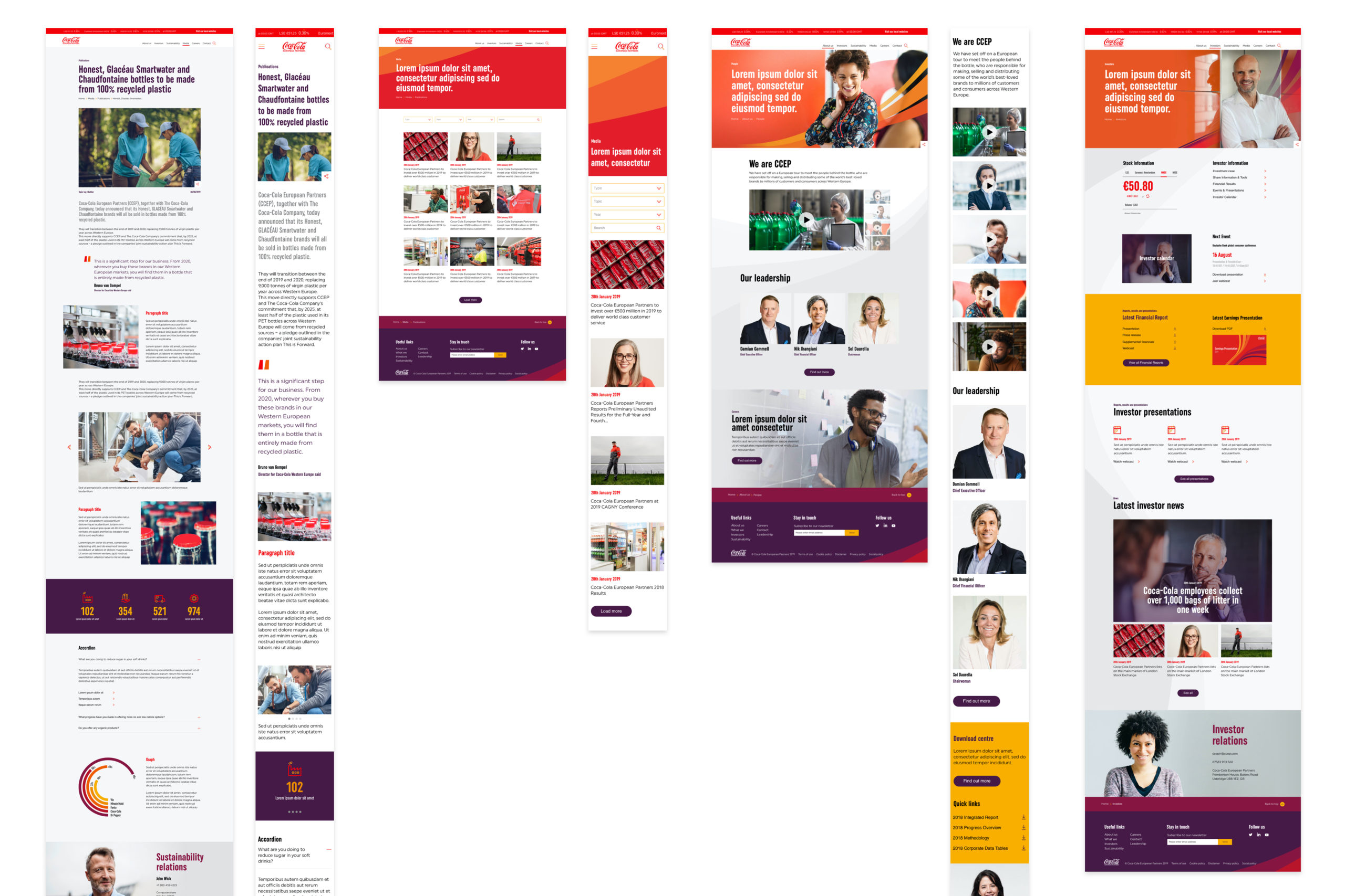
Based on the personas provided by the client, I have mapped out user journeys to identify the most efficient flows. To measure the effectiveness of the new IA and the user journeys, I have created wireframes and InVision clickable prototypes that were then tested by the CCEP employees and our internal panel. 

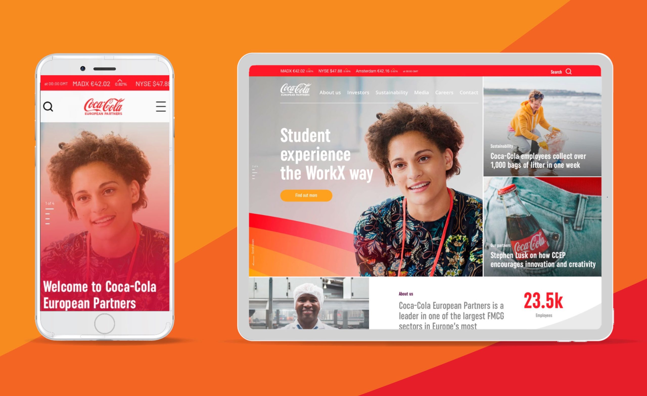
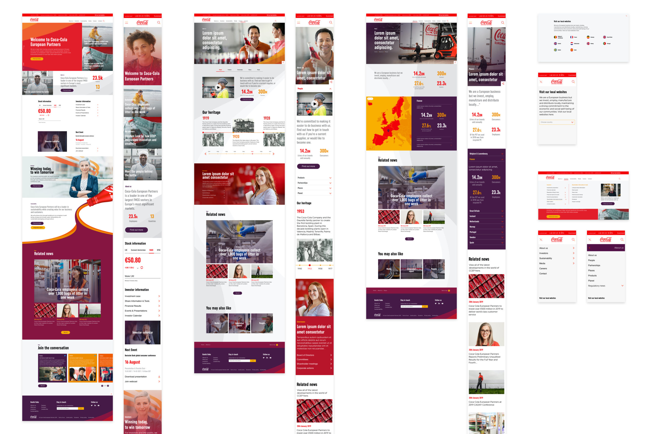
Upon establishing a strong UX, I have designed a UI concept that was brought to life by the motion design team to get it signed off by the client. I have then managed my UI team to further develop and implement the UI concept.
Throughout the process, I was in charge to present the outputs of our work to the relevant stakeholders (CCEP leadership team and development team) and ensured the delivery of our project within our quality standards and in timely manner. 

Heuristic audit of the existing website

I analysed CCEP’s website from four different perspectives:

  • Information architecture
  • Content
  • Functionality 
  • Layout

The findings were then used as a starting point for preparing our client workshop.

Information Architecture

To better immerse visitors, the ‘about us’ section is used as a narrative hub that place the five pillars of the company at its core

I then linked all these pillars to deeper part of the section for users that are willing to engage further with the business

User personas

Selection of personas developed for the project

Exploration of CCEP user journeys against defined personas

Selection of user journey developed for the project

Wireframing process

Wireframes enable us to map out the structure of each pages and provide a better understanding of the narrative to various stakeholders.
Once linked together via InVision, they also help optimising the user flow after being tested by users

Selection of wireframes developed for the project

Visual design

Interaction design

I worked with a motion designer to add meaningful animations and dynamic movements throughout the site, to aid user engagement.